
Identity | Signage
People, Place, Purpose
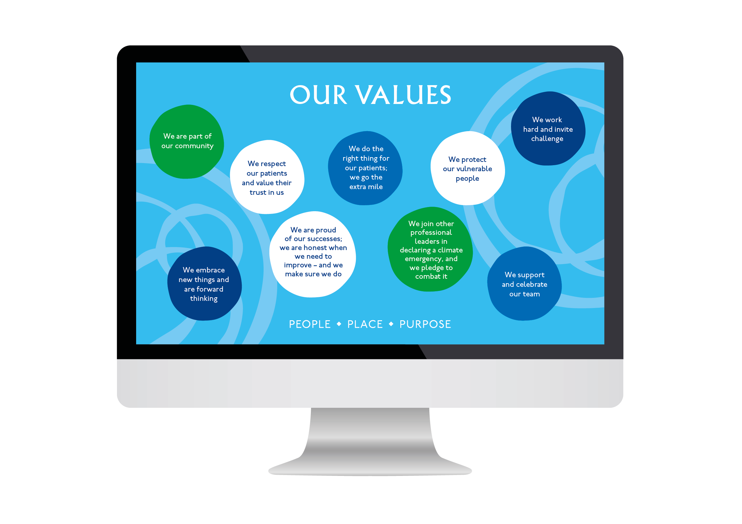
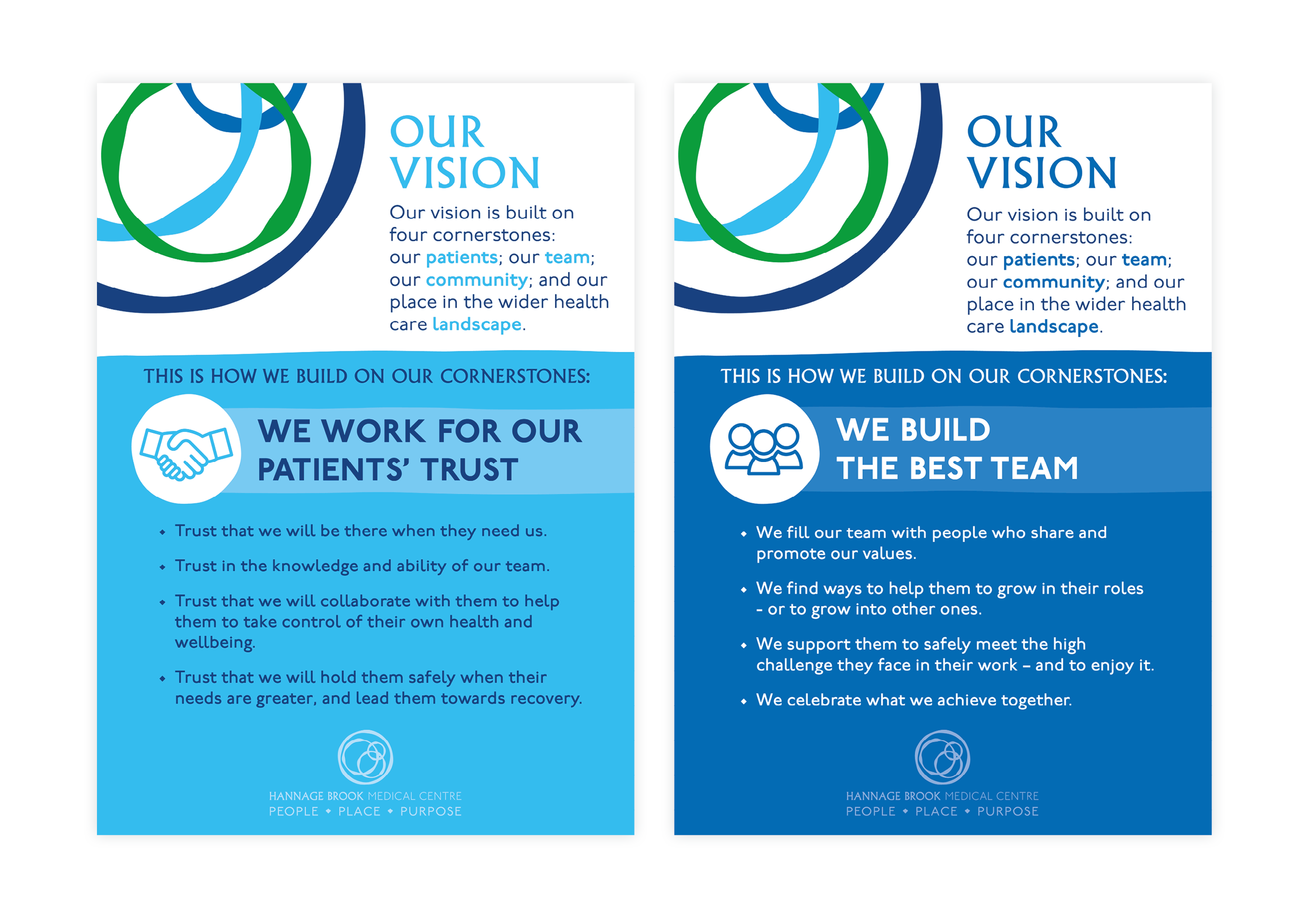
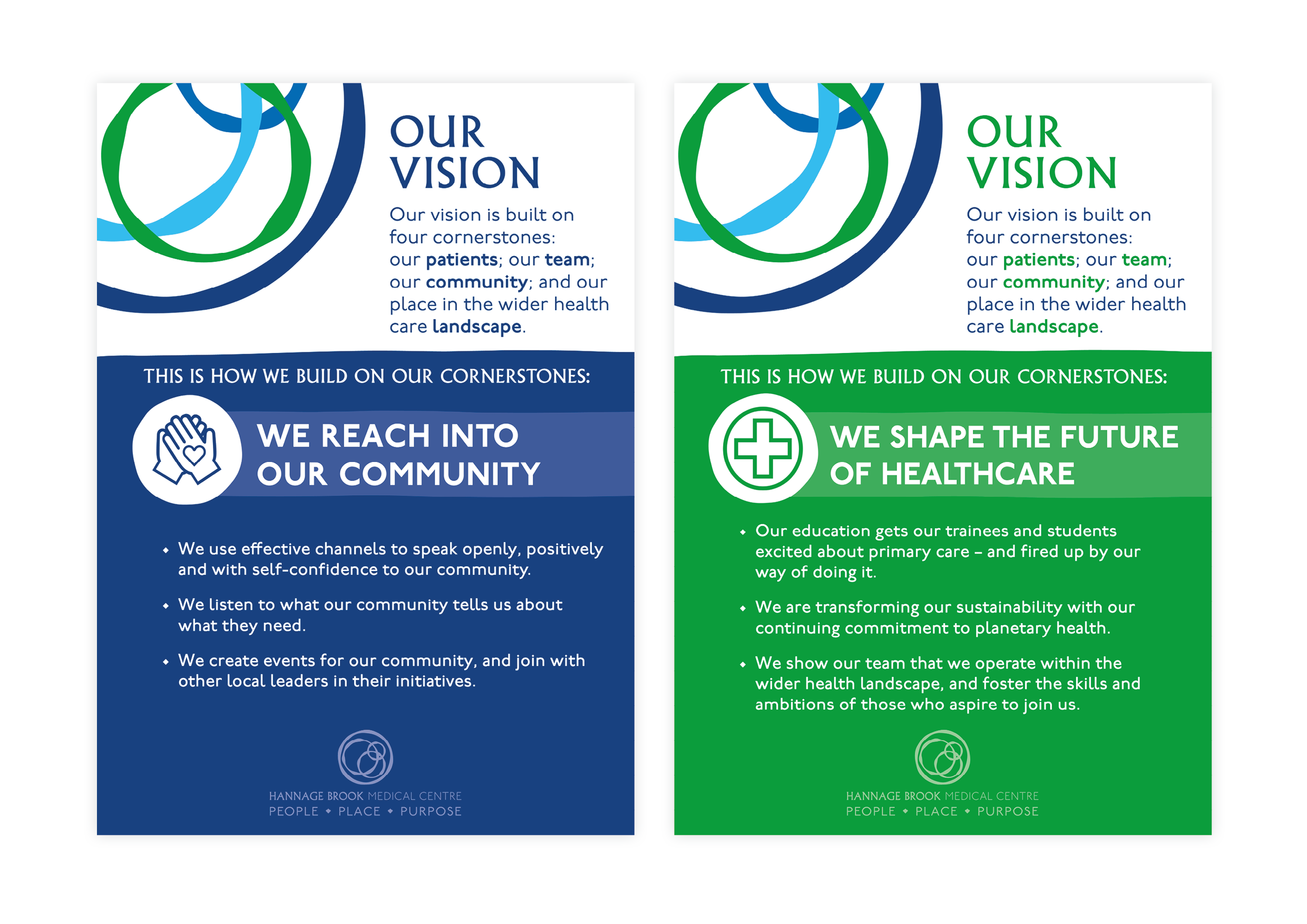
This branding and signage project was developed to create an identity that genuinely reflects the community Hannage Brook Medical Centre serves. Inspired by the ripple effect of water - with Hannage Brook running directly alongside the medical centre - the logo symbolises connection, care and the far-reaching impact of healthcare within the local area. The design uses the trusted NHS blues and greens, reinforcing reassurance and wellbeing while referencing the surrounding natural landscape. Beyond the logo itself, a comprehensive signage system was developed, ranging from the main external sign to internal wayfinding and Values and Vision posters, all designed to clearly communicate the centre’s ethos and reinforce the practice’s commitment to serving and supporting its community.