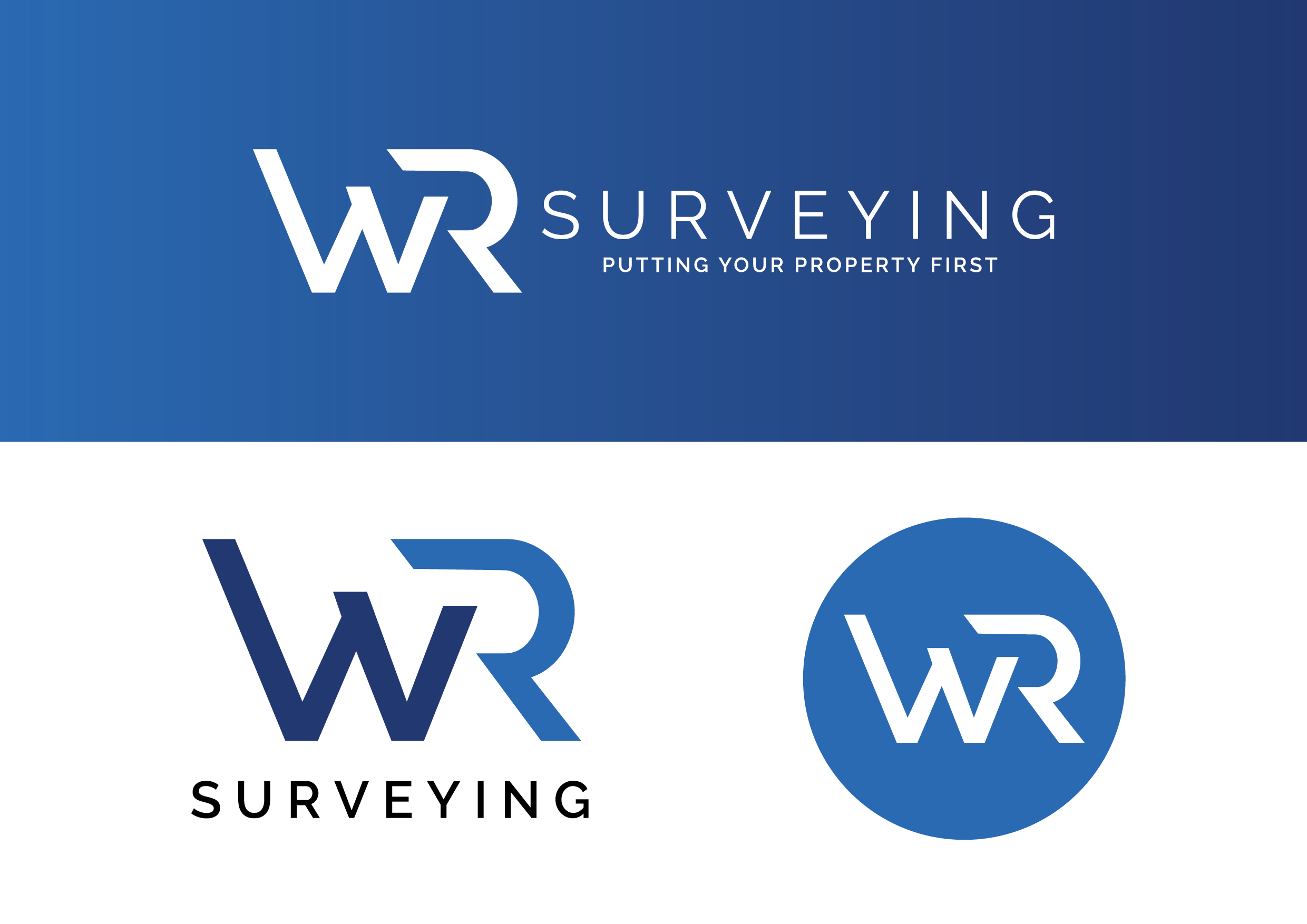

Identity Development | Mini Branding Guide
Design to navigate property purchases
WR Surveying a family-run surveying firm, sought a brand refresh with the objective of crafting a distinctive and polished brand mark. In this redesign, particular emphasis was placed on the W and R letters, which stand independently while harmoniously collaborating. This intentional design not only reflects the solid partnership between the company and its customers but also communicates a sense of trust and reliability. The resulting brand mark is both bold and sleek, aligning seamlessly with WR Surveying's commitment to excellence in surveying services.